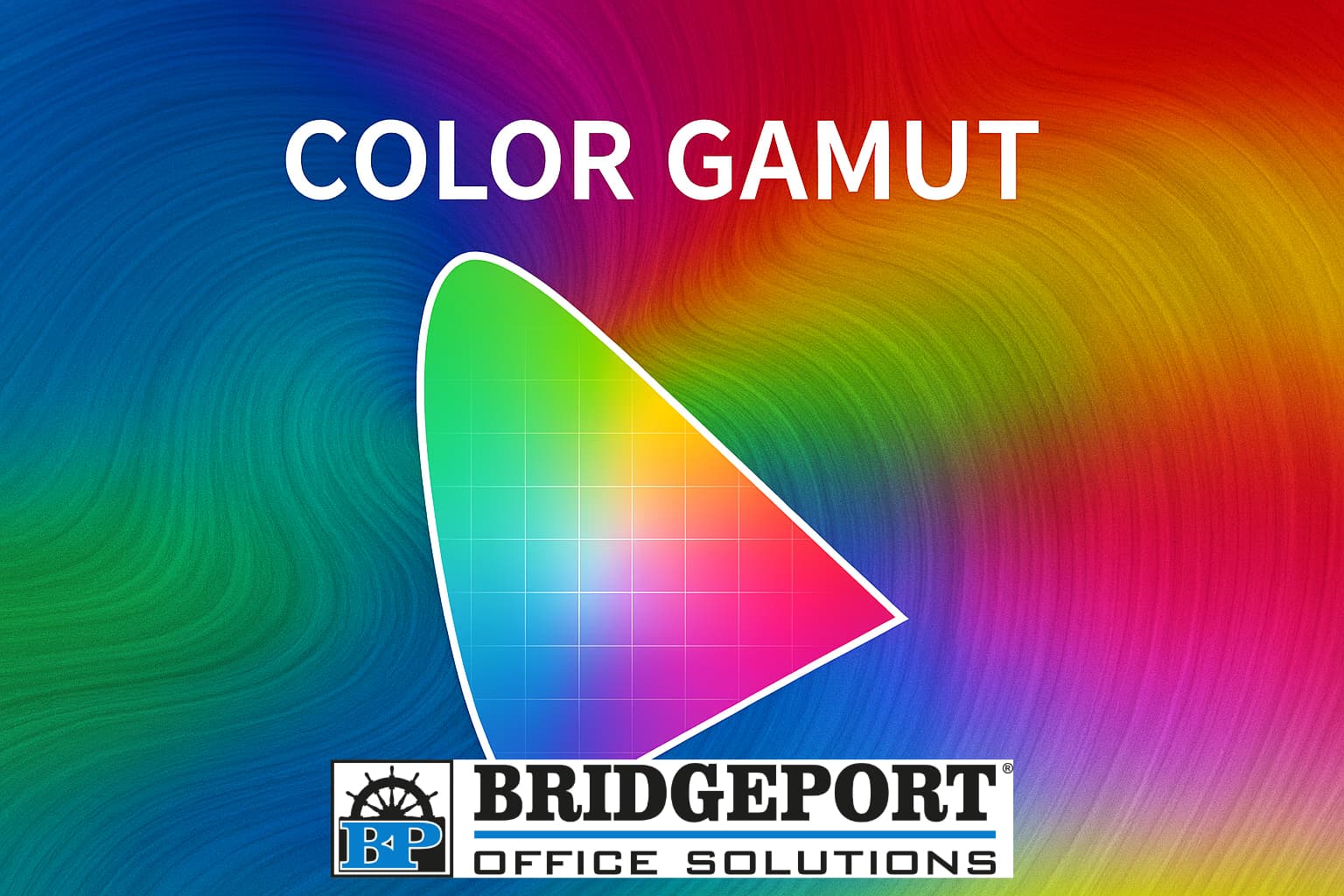
Why your screen and printer don't always agree
Ever designed a vibrant flyer on your computer or created amazing artwork in a graphics program, only to find the printed version looks a little bit…. Dull? That disconnect between screen and print isn’t a glitch, it is a matter of colour gamut.
What is a colour gamut?
A color gamut is the complete range of colors that a device, such as a monitor, printer or camera, can accurately reproduce. Think of it like a package of crayons. Some packages have 64 crayons and can produce much more colours than a package of 24 crayons.
Different devices use different color models. A color model is a system that defines how colors are represented using numbers. Two primary models that many people are familiar with are RGB (red, green, blue) and CMYK (cyan, magenta, yellow, key/black). Check out our blog Colour RGB and CMYK for more information on these colour models.
Each model has its own gamut, and they don't fully overlap
How does it work?
A color gamut is often visualized as shapes within a color space which maps human-visible colours. For example:
When you design something in RGB and print it in CMYK, the printer must approximate colours that fall outside it’s gamut, often resulting in muted or shifted colors.
Why is it important?
Understanding colour gamut is crucial for:
Without this knowledge, you risk colour mismatches that can affect perception, professionalism and even emotional resonance.
Why printers and copiers can't match your monitor
Here is the crux: printers and copiers physically apply ink or toner to paper, while monitors emit light. That fundamental difference means:
Even high-end printers with extended ink sets still can’t fully match the luminous glow of a backlit scree.
Each device has its own colour gamut
Even the gamut from device to device is slightly different. You can have two of the exact same models of monitors, but they will produce slightly different colours. Same with printers. Two printers of the same model will produce slightly different colours.
Tips for better colour consistency
Colour gamut may seem technical, but they are key to unlocking visual harmony across mediums. Whether you’re crafting a wedding invitation or a corporate brochure, understanding how colour works ensures your vision stays true from screen to print.
Looking for a printer that will help translate your digital designs into amazing prints? Contact us today! We love bridging the gap between pixel and paper!
