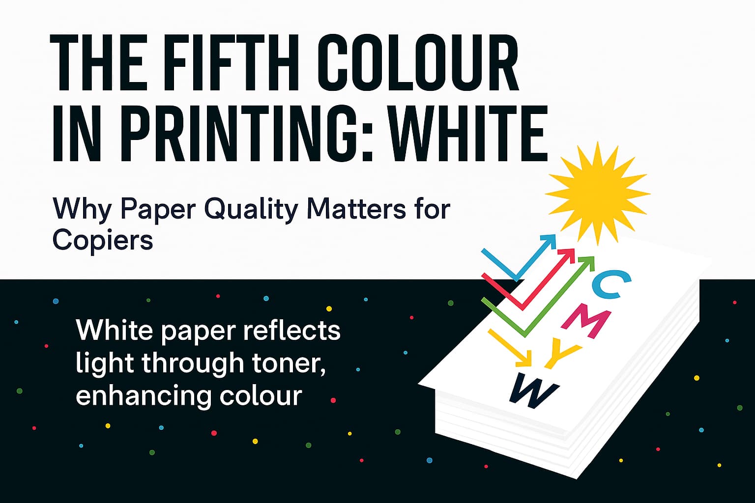
When we think of printing, our minds jump to the four toner colours: Cyan, Magenta, Yellow and Black (Key) - CMYK. But there’s a silent partner in every print job that deserves equal billing: white. Not the toner, but the paper itself. In fact, white can be considered the fifth colour because it’s the canvas that defines how the other four perform.
When you print with CMYK toner, you're not just layering opaque paint. You apply translucent pigments that interact with light. The final colour you see isn’t just the toner, it’s the light that reflects off the paper, passes through the toner layer and returns to your eyes.
This means that the paper underneath plays a starring role in colour reproduction. If the paper is dull, yellowish or unevenly white, your output will reflect this with loss of colour tone, dull blacks and inconsistent colour reproduction.
The foundation of every print
Paper isn’t just a passive surface. Its quality affects:
Low-grade paper can cause jams, dust buildup, and uneven, low-quality output. High quality paper, on the other hand, ensures smooth operation and professional results.
Why white matters as much as CMYK
White paper isn’t just “blank”; it’s the backdrop that shapes every colour you see. Think of it as a stage: if the lighting is off, even the best performers look dull.
Here’s how whiteness impacts your output:
It’s especially critical for photographers, designers, and marketers who rely on true-to-life colour reproduction.
The visual payoff
Whether you are printing a wedding invitation, brochure, invoice or a photograph, the whiteness of your paper:
It’s especially critical for photographers, designers, and marketers who rely on true-to-life colour reproduction.
Performance meets presentation
High quality white paper also:
So, while CMYK gets the spotlight, white deserves a standing ovation. It’s the unsung hero of every print job.
Final thoughts
If visual impact and polish are important, and you want to reduce malfunctions and extend the life of your equipment, choosing the right paper isn’t just smart, it’s strategic.
